Where the Disabled Button Got Its Rule
What Apple's 1980 rules said about greyed-out commands
In many chat apps, the Send button stays grey until something has been typed in the message box. Clicking it does nothing, and pressing Tab skips straight past it.
This is a disabled button. In HTML it takes one attribute, disabled, and almost every design system ships it as a standard state of its button component.
Eight widely used design systems are compared below: Google's Material, IBM's Carbon, Shopify's Polaris, GitHub's Primer, Atlassian's design system, Adobe's Spectrum through its React Aria library, the UK government's GOV.UK Design System, and shadcn/ui. All eight have a disabled state on their button. Primer, Atlassian and GOV.UK also have written guidance recommending that teams avoid it.
The eight draw their disabled buttons differently. Contrast ratio is the measure the Web Content Accessibility Guidelines (WCAG) use for legibility. It runs from 1:1 for two identical colours to 21:1 for black on white, and 4.5:1 is the usual minimum for body text. A disabled label in these systems sits between 1.36:1 and 3.35:1 against its button. In all eight, a disabled button can't be clicked or reached with the Tab key.
The primary button of eight design systems, enabled and disabled, in each system's light theme. Disabled label contrast ranges from 1.36 to 1 up to 3.35 to 1.
The rule that a disabled control can't be chosen wasn't written for buttons. Its earliest known written version is for menus, in the interface rules for Apple's Lisa, the office computer Apple developed before the Macintosh. Like the Mac after it, the Lisa kept commands such as Cut, Copy and Save in menus along the top of the screen. Buttons took the rule over later, and by then it had changed.
Apple's first rule for dimmed menu items

The Lisa team wrote down its interface rules in September 1980, more than two years before the computer was announced. The Lisa User Interface Standards was an internal document signed by Bill Atkinson, the project leader, who later wrote MacPaint. The scan online today comes from the collection of the Lisa historian David T. Craig. Its numbered sections on windows, menus, selection and editing commands are laid out much like a design system's guidelines today.
Section 26 is titled “Menu items that do nothing”. It allows an application that knows a command would have no effect to dim that command in the menu. The next sentence reads “Such an item can be invoked anyway, if the user wishes.” So a dimmed menu item could still be chosen. It just wouldn't do anything useful at that moment.

The standard's example is Cut, which removes the selected text. With nothing selected, Cut has nothing to remove, so the menu item is dimmed. For commands that switch a setting on and off, such as Bold or Turn Printer On, the dim highlight also showed whether the setting was on.
The rule that shipped in 1983
Apple announced the Lisa in January 1983. Its software shipped with tutorial manuals, and the one for LisaDraw, the drawing program, starts with a lesson on opening the hard disk from the File/Print menu. Under a screenshot of that menu on page A9 is a one-line note: “Note: When a menu item is dim, you can't choose it” (scan).
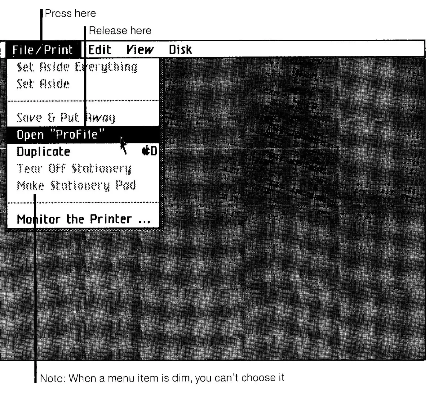
Between the 1980 standard and the shipped machine, dim stopped meaning “this will do nothing” and started meaning “this can't be chosen”. Apple also wrote Lisa guidelines in 1983, but the only part that has been scanned is the introduction, which covers windows and doesn't mention menus. In 1997 three of the Lisa's designers, Rod Perkins, Dan Keller and Frank Ludolph, published a detailed account of how its interface was developed, Inventing the Lisa User Interface, and it doesn't mention dimming either.
No Lisa document available today says when the rule changed or why.
The Lisa's screen was black and white, with no grey available, so in the manual's screenshot the dim commands, such as Set Aside and Save & Put Away, are drawn in a broken, stippled type, with pixels knocked out of every letter. Enabled commands like Duplicate sit beside them in solid type. Menus today still follow the 1983 rule. A greyed-out menu item can't be chosen, and only the way it's drawn has changed.
A dimmed menu item drawn two ways, magnified to the same size. On the Lisa in 1983, a dim menu item had every other pixel of its letters removed, because the screen could only show black or white. In a Material 3 menu today, a disabled item's label is drawn at 38 percent opacity. Neither can be chosen.
From menus to buttons
The Macintosh, released a year after the Lisa, kept the stricter rule. Inside Macintosh, the reference Apple published for Mac developers in 1985, says “A disabled item cannot be chosen; it appears dimmed in the menu and is not highlighted when the cursor moves over it.” The Mac also had dialog boxes, the small windows that ask a question and offer buttons such as OK and Cancel. Inside Macintosh's glossary applies the same rule to them, saying a disabled item in a dialog box “has no effect when clicked.” Buttons are one kind of dialog item, so this is where the menu rule reaches them.
HTML 4, published in 1997, brought the rule to web forms. It added the button element and a disabled attribute for form controls, and its description of disabled controls says much the same as Inside Macintosh: “Disabled controls do not receive focus.” “Disabled controls are skipped in tabbing navigation.” On appearance it leaves the details to the browser, noting that some browsers “gray out” disabled menu items and button labels. For a Send button, the difference is one attribute.
<!-- enabled -->
<button type="submit">Send</button>

<!-- disabled: no clicks, no focus, skipped by Tab -->
<button type="submit" disabled>Send</button>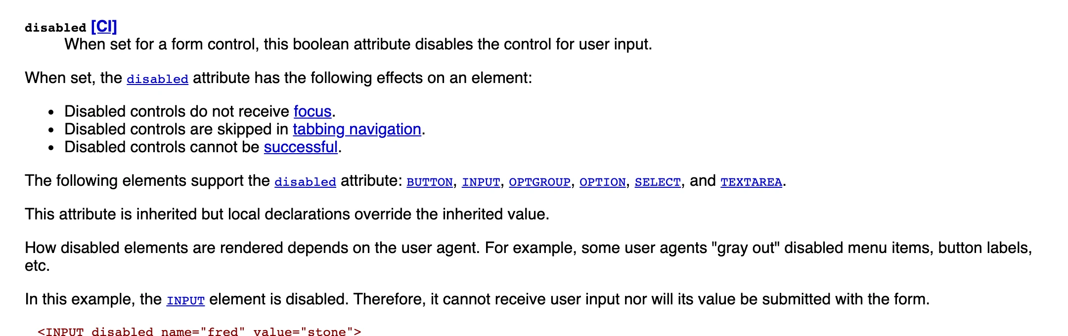
Browsers still work this way. A button with the disabled attribute ignores clicks and is left out of the tab order. A screen reader user reading the page line by line may still come across it, announced as unavailable, but won't reach it by tabbing between controls.
In a menu, the reason an item is dimmed is usually close by. The Lisa standard's own example, Cut with nothing selected, depends on the selection in the document right behind the open menu. A button carries the same rule wherever it's placed, including forms and dialogs where the thing it's waiting for may be further down the page, or not on the page at all.
The disabled button today
Seven of the eight systems build their disabled button on HTML's disabled attribute, so they get the browser behaviour described above. Polaris is the exception, and the difference only shows up in the code it publishes on npm, the public JavaScript registry.
Polaris's documentation describes a disabled button. Its code renders aria-disabled instead, an attribute normally used to keep a control focusable, and then adds tabIndex="-1", which removes the button from the tab order anyway.
<!-- Polaris, disabled (class names removed) -->
<button type="button" aria-disabled="true" tabindex="-1">Save</button>
Shopify adopted this pattern in 2022. Other parts of the library still treated those buttons as focusable, and the focus-trapping code used in dialogs had to be changed to skip them.
GOV.UK and shadcn/ui lower the whole button to 50% opacity, so it keeps its colour and fades into the page behind it. Material, Carbon, Polaris, Primer and Atlassian instead set specific disabled colours as design tokens, the named values a system uses for colour, spacing and type. Carbon's primary button turns from blue to a flat grey, #c6c6c6, with a darker grey label. Material's tokens are opacities rather than colours, 12% for the background and 38% for the label. The first Material guidelines used the same 38% for disabled text.
WCAG doesn't set a contrast minimum for disabled controls. GOV.UK's green button measures 5.35:1 when active and 2.13:1 when disabled, which would fail as ordinary text. WCAG's contrast rule says text that is “part of an inactive user interface component” has “no contrast requirement”, and the W3C's explanatory notes give the example of “a submit button at the bottom of a form that is visible but cannot be activated until all the required fields in the form are completed.” Most of these systems rely on that low contrast to show that the button is unavailable.
Atlassian's guidance says “Avoid disabling buttons, especially in forms” and recommends keeping the button pressable, with validation messages explaining what's missing. GOV.UK's says to “avoid them if possible” and to use them only “if research shows it makes the user interface easier to understand.” Primer's guidance also says to avoid them. Polaris and Carbon accept the state and ask that the surrounding interface explain why the button is unavailable. Material, Spectrum and shadcn/ui don't take a position. GOV.UK still added a dedicated disabled option to its button component in 2023.
| System | Markup | Contrast | Guidance | Reachable state |
|---|---|---|---|---|
| Material 3 | disabled | 6.44 to 2.26:1 | No position | softDisabled |
| Carbon | disabled | 5.00 to 1.94:1 | Asks for a reason | read-only |
| Polaris | aria-disabledtabindex="-1" | 13.20 to 1.48:1 | Asks for a reason | None |
| Primer | disabled | 4.52 to 1.50:1 | Advises against | inactive |
| Atlassian | disabled | 5.20 to 1.94:1 | Advises against | None |
| React Aria | disabled | 5.17 to 1.36:1 | No position | isPending |
| GOV.UK | disabledaria-disabled | 5.35 to 2.13:1 | Advises against | None |
| shadcn/ui | disabled | 17.18 to 3.35:1 | No position | None |
Disabled but reachable
WAI-ARIA, the W3C specification for describing controls to screen readers and other assistive technology, added a second option after HTML 4. The aria-disabled attribute marks a control as unavailable and changes nothing else. The button stays in the tab order and still receives clicks, so the developer has to write the code that stops a click from doing anything. A button with aria-disabled can be reached and pressed and does nothing, which is close to what Section 26 of the Lisa standard described for menu items.
Nothing has focus yet.
<button disabled>disabled</button><button aria-disabled="true">aria-disabled</button>if (button.ariaDisabled === 'true') event.preventDefault()aria-disabled button, because the one with disabled can't take focus. The aria-disabled button can also be clicked, and the last line of code is what stops the click from doing anything.Two of the eight systems have added a disabled button that stays reachable, alongside the standard one. Material's web components have softDisabled, which the source code describes as “disabled but still focusable” and recommends when a button “needs increased visibility when disabled.” Primer has inactive, for outages, when a system error stops the button from doing its usual job. It is drawn at 5.06:1 contrast, higher than Primer's disabled style, because “inactive buttons can have tooltips or perform an action such as opening a dialog.” Two more have states close to it. Carbon has a read-only state alongside disabled, for fields that can't be changed but stay readable and available to screen readers. React Aria has isPending for buttons waiting on a request, which “disables press and hover events while retaining focusability, and announces the pending state to screen readers.”
- Add a title to publishMaterial
softDisabled, tooltip on hover - Primer
inactive, note on click
softDisabled button shows a tooltip saying what's missing. Primer's inactive button opens a note about the outage. A native disabled button can't do either.Atlassian's guidance says “Never put tooltips on disabled buttons,” because a tooltip on a control that can't receive focus can't be opened from a keyboard or by some assistive technology.
To explain why it's unavailable, a button has to stay reachable.
The W3C's keyboard guidance, in its ARIA Authoring Practices, makes a similar distinction. It treats the native disabled attribute as suitable for controls whose state is clear from what's around them, such as a Previous button on the first page of a table. Menu items, tabs, list options and toolbar buttons like Cut, Copy and Paste should stay reachable with aria-disabled, because “screen reader users are far less likely to discover disabled elements that are not focusable.” The systems that offer both states split them in much the same way. The strict state is for an action that can't be attempted at all, such as a second submit while the first request is still being sent. The reachable states are for something the person can fix or wait out, such as a missing permission, an incomplete form or a service that is down. GOV.UK and Atlassian prefer a button that can always be pressed, with error messages saying what's missing.
A reachable state takes more work to build. With the native attribute, the browser blocks clicks and removes the button from the tab order without any extra code. A reachable state needs code that blocks the click, focus handling that doesn't break keyboard navigation elsewhere, and a reason placed where a screen reader will announce it.
Buttons took the strict version of a menu rule through Inside Macintosh and HTML 4, into forms and dialogs where the reason for dimming often isn't close by. A reachable disabled button is similar to what the Lisa team first wrote down in 1980, though Material and Primer added theirs so that keyboard and screen reader users can find the button and be told what's wrong. The disabled button got its rule from a menu, and the reachable states are where that rule is being rewritten for buttons.